Accordion
Accordion 1
Equalize Digital Web accessibility lorem ipsum dolor sit amet, inclusive design ensures equitable access to digital content by users of all abilities. WCAG guidelines provide a robust framework for perceivable, operable, understandable, and robust interfaces. Screen reader compatibility, semantic HTML, and sufficient color contrast are essential components. Vestibulum aria-labels turpis at ex facilisis, enabling assistive technologies to navigate meaningfully. Keyboard navigation must not be overlooked—tabindex management and focus indicators enhance usability. Placeholder text non est label; use relationships instead. Donec alt attributes for images improve comprehension for non-visual users. Accessible design isn’t just compliance—it’s universal usability.
Accordion 2
Accordion 3
Carousel/Slider
Form
Note: this is a fake form. No emails will be sent.
Icon List
Loop/Posts Block
-
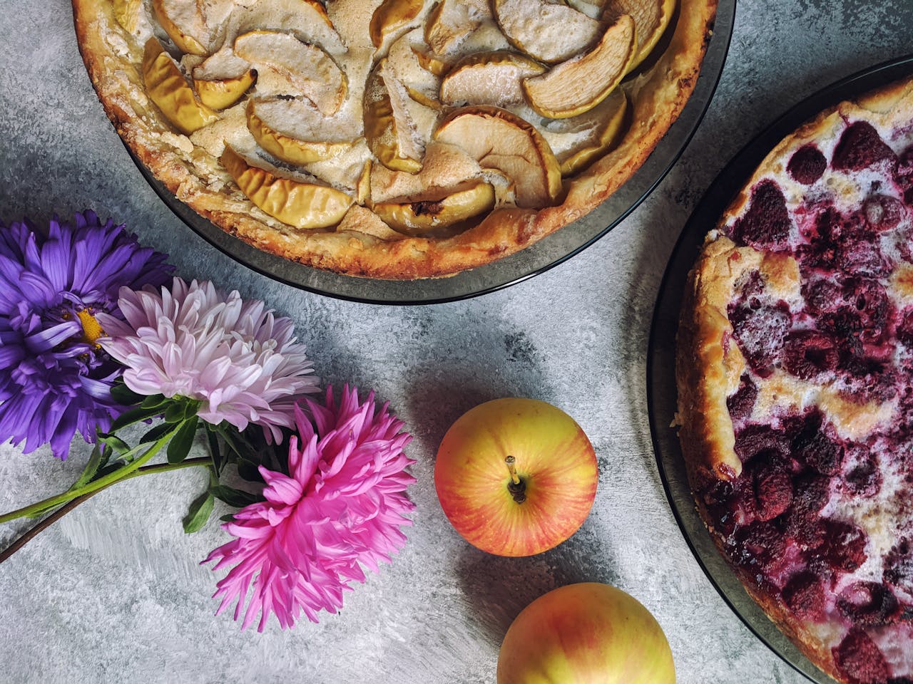
Two Pies, Twice the Delight – Now Baking Fresh Apple & Berry Pies
At Butter & Bloom Bakery, we believe there’s no wrong way…
-

Meet Sarah – The Heart Behind Our Bakes
At Butter & Bloom Bakery, every delicious creation begins with a…
-
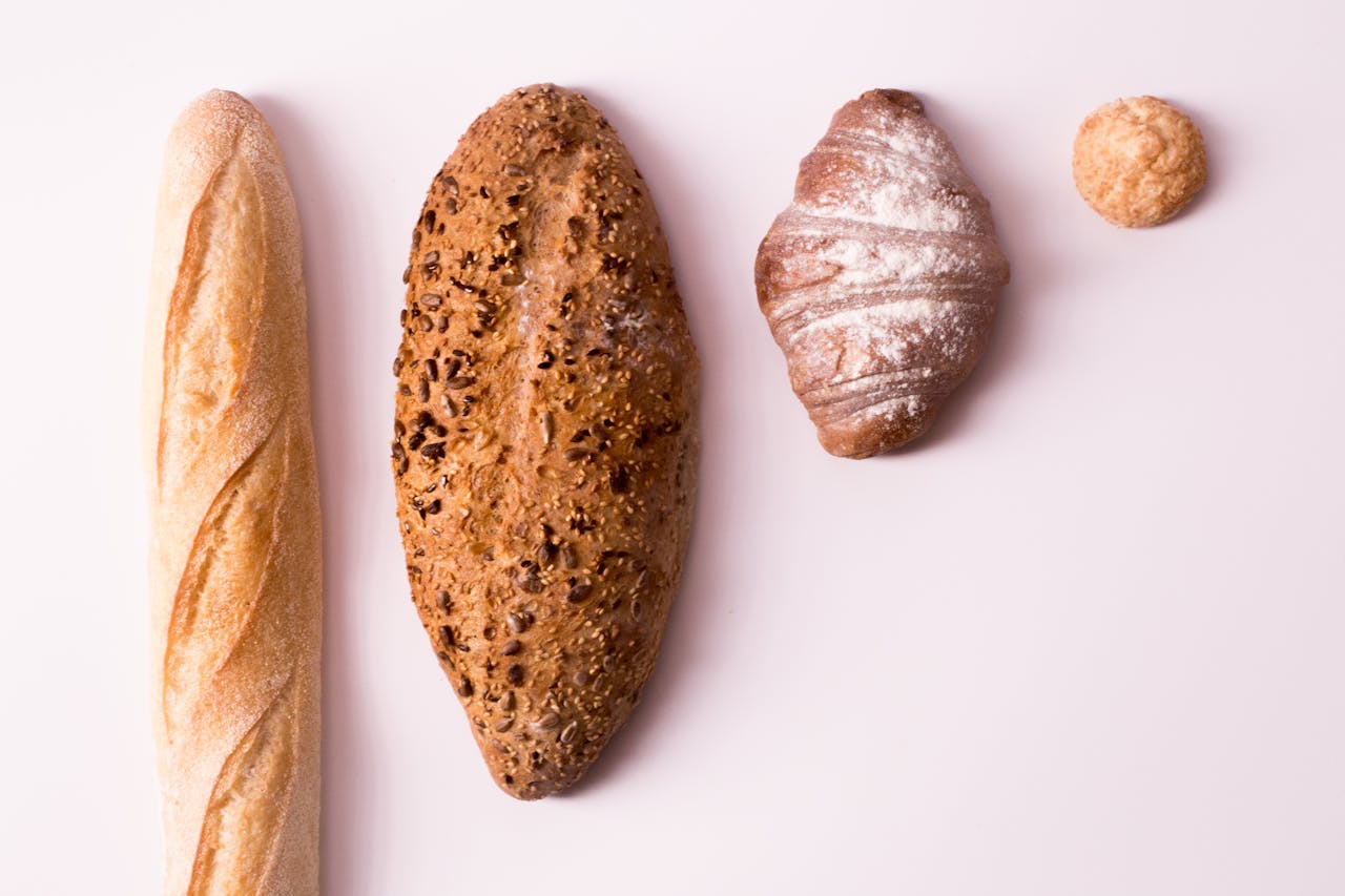
Our Bread, Our Process – Baked to Perfection Every Time
At Butter & Bloom Bakery, we believe that a perfect loaf…
Tabs
Testimonials
No testimonials block available.
Screen Reader Text Support
If no text outputs here beneath the headings, that means that the theme has added that class for screen reader text. If text is visible, the theme does not support the class. Only one is sufficient for a “pass” — they do not both have to be supported.
.screen-reader-text
This text is wrapped in the .screen-reader-text class.
.sr-only
This text is wrapped in the .sr-only class.